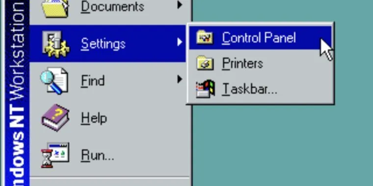
On brand. Settings is like control panel but dumber.
I love how in settings all the different miuse options are spread out in different places!
Want to change mouse speed, cursor size, and color? We are going on an adventure!
Even more frustrating is that different releases and builds recategorize where certain settings are entirely. To the point where search is the only reliable way of knowing for sure you’ll get to the right place. They haven’t changed things too drastically recently but they kept moving shit around in Win10 throughout its lifetime.
The older and older I get in life, the more and more I want my digital product interfaces to remain as static as possible. I’m not anti new features, but I want the ability to persist the OG interface I’m used to, the state in which I know WHERE things are, and HOW to utilize them.
I don’t want app icons to change without my consent. I want zero rebranding, name or color changes. I don’t want to be forced to change services due to enshittification, and learn how to fit new ones into my workflows.
One of the core problems with the modern world is confusion of information. Our brains were not designed to handle the infinite layer of abstractions, dozens/hundreds of separate systems, each with potentially hundreds or thousands of different configurations. Every time a major update occurs it breaks my mums tech illiterate brain more and more, and she stops using digital products more and more.
This is how I feel as a software engineer. I’m sick of learning new libraries every time fashions change.
My uncle can navigate windows xp with his eyes closed. It took me years to get him there. He was fine with vista and 7. When 8 hit, it was over and it has been since.
This is a religious man who I’ve only ever heard cuss twice in his life before, and they were the milder words. “What the fuck is copy as a path? I’m just trying to copy and paste a file to my Zip drive! I can’t find computer, I can’t find my computer. I can’t find copy and paste! I’m gonna throw this thing across the room! Seriously, show more options? Why not leave the options I’ve had since 1996 where they were? Do people just not copy and paste any more?”
I have given up and I just remote connect and do it for him. He tried for a few years with the “slow down and let me learn” thing but he’s almost 70 and he’s given up.
He calls his usb drives “zip drives”. He was the only person I knew who had an actual Zip drive when I was a kid and I loved it.
I get the feeling, but in my experience it has more to do with the windows UI actual getting worse. When I use Linux, I’m happy to try out different desktop environments and shells, but they have one thing in common: they have designs that are created more thoughtfully.
It’s not just us growing old, it’s the world of technology growing shittier too!
I don’t care if things stay the same, I just want an intuitive interface.
I bet AI would be helpful here!!
“I’m New Clippy. I’m here to help you, like it or not!”
Hey, Clippy! Change the settings so that I can view hidden files . Clippy: Ok. Shutting down the nuclear reactor.
Not great, not terrible…
But it was, in fact, terrible, very terrible indeed
Not great, not terrible…
I send the gif of that scene at least once a week at work over teams
There a lot of non AI implementations that would be more reliably logical, like presenting options in multiple groups instead of only having a single location buried in submenus.
Like mouse color and size could be in an appearence AND in a general mouse settings that includes mouse appearance and behavior. They could design it so the setting itself is self contained, so it can behave the same way no matter how it is grouped for presentation.
I would expect AI to make up illogical groupings, because it doesn’t understand context.
I believe they were joking since Microsoft is pushing AI into everything these days.
You’re not around a lot people that joke, are you?
Ever heard of Poe’s Law?
It isn’t a story that the Jedi would tell you.
The only benefit is more tightly integrated Powershell commands for some of them… but even that is still lacking in a lot of areas.
If Microsoft had actually moved all the settings over to the “new” settings app (it’s 12 years old, btw), I’d be supportive of this.
It’s a joke that windows has 2 settings apps, and searching for specific settings in the start menu will take you to either, or to both.
But as we all know, Microsoft won’t do this properly. They’ll likely just continue with their 75% finished settings app while hiding the control panel, and if you need something not in the settings app you’ll have to open some old menu using a run command or some other terrible convoluted step that makes you feel like you’re running a half-baked Linux distro from 2003.
MacOS, Android, iOS, Linux distros don’t have this issue. Fucking TempleOS doesn’t have this issue. Microsoft is a $3.2 trillion company!
The absolute lack of effort they put into Windows is pathetic. They’re a shining example of why monopolies should not be allowed to happen.
the thing that most grinds my gears is that there are settings that appear in both control panels and settings, appear to be changeable in both, but only one or the other actually changes anything.
I hate the settings app so much that I’ve just learned the powershell commands for setting up printers and changing NIC settings. Honestly it wouldn’t be as bad if a. It didn’t take forever to load on occasion and b. I could have two settings windows open at once.
It’s so hard to find settings there that jumping between network center and add device is not intuitive. If they remove control panel from servers too I might quite my msp job and go work at a grocery store.
Does Linux have good support for VR yet? Specifically my HP Reverb g2 that seems to be reliant on windows mixed reality…
I’ve never tried VR on any OS, but from what I’ve heard it’s hit and miss on Linux right now - certainly not as good as Windows at the moment.
I know that KDE has a lot of stuff for VR (unsurprising given Valve is pushing for it), and Gnome has just merged a lot of the same, so if you give it a spin I’d recommend an up-to-date distro (say Fedora or OpenSUSE Tumbleweed) with either KDE or Gnome.
I imagine that when Valve releases their new headset, progress will accelerate, but that’s just a guess
Interesting, thank you
Also was unaware Valve was working on a new headset! That’s good news as it feels like the market has really stagnated outside of the Meta headsets.
I wouldn’t get too excited. Supposedly the next headset is internally called Deckard, and it’s been “about to release” for like 3 years now? Pretty much everything people think they know about it is conjecture based off code Valve has tucked away in SteamVR; zero public statements of intent.
As for VR on Linux… kinda? I’ve only read terrible things about it online. I have an Index and tried to use it with Mint a few months back, and while it mostly worked without any configuration issues, there was a weird white ring around the edge of the screen that I couldn’t figure out.
zero public statements of intent
To be fair, when has Valve ever done this?
About as often as they actually release anything
I have the same headset, and as of a few weeks ago when I last checked, there is not complete support. I think the display works mostly, but the controllers don’t so it might depend on what you are doing.
Interesting - I rarely use the controllers, so could be do-able at least as a dual boot
Just a curious question - Is there any VR sets that work with Linux Distros? I’m not much of a gamer to need or want one. Just want to learn for learning’s sake.
They need to finish Settings before doing that. Control Panel is almost always the easier way to accomplish things and still the only way to accomplish some IIRC.
And it doesn’t take years to load, specially on older PCs
And you can have more than one instance open at a time, instead of having the sound page open and when you try to bring up bluetooth next to it it changes the first one instead.
This is so frustrating when trouble shooting - trying to re-find where that one settings page was because you opened another.
It’s not a phone - it’s a windowing desktop environment. Allow multiple instances!They literally already tried and failed with the phoneification of windows when everyone shat on 8. I guess some ahole UI designer still works there and is bitter that people didn’t like their ideas.
I had to do a lot of configuration work on Win10 computers lately. The MMC, Powershell, even Regedit are faster and more intuitive than Settings. It’s fucking ridiculous.
Settings in Windows 11 is close. I rarely find myself going to control panel when it was about 50/50 in Windows 10. Still more clicks than I would like but workable.
This. Settings does not have full audio devices information and settings.
Oh no. They really want me swapping to Linux full time with this shit, ugh.
What’s stopping you?
Just get it over with.
The setup, mostly. I know I can VM my mandatory work programs, at least. Dual boot has been too frustrating since Windows won’t play ball.
I am glad I waited on dual boot since the recent patch broke that. So, now I’m looking for a good way to just go all in without losing too much data.
I really just need a stable kernel with a decent UI that works with Gaming/Proton AMD CPU and Nvidia GPU.
The distro choices are too expansive and I haven’t had to start fresh in a new OS in 30 years.
I play games on Pop_OS (NVIDIA edition) and also run an AMD CPU. Great experience for 2 years now.
Just start with Linux mint and cinnamon or kde desktop environment. You should be good to go with that. Kernels are not something that you usually need to worry about, the default should work fine. If you need to, it’s easy to switch to another kernel by just installing it through the package manager.
Well I spent Sunday night installing Manjaro and so far so good. It’s been almost 30 years since the last time I used Linux, and KDE Plasma is really easy to use.
I decided to wipe my Win 10 drive so there was no going back. I was able to install and play games like normal, and I even used the command line to pull and build the Mullvad VPN App from the Arch store, and sign the app certificate.
The best part was once I setup the steam libraries Steam pulled all the information from those drives and all my games that weren’t on my Windows SSD were ready to go. All of my peripherals just worked and the Nvidia driver was fine.
I’m just missing some GOG Games, but Heroic should take care of that. Painless and simple.
It’s amazing how much has changed in over 20 years.
I’d recommend looking into Bazzite. Built on top of Fedora for rock solid stability and relatively up to date kernel (with all the latest drivers).
They’re shooting for the same stability and high level gaming experience as Steam Deck, but for any computer.
I use Bluefin because I’m less bothered by gaming, but it’s been absolutely fantastic with the stability and ability to run anything I’ve tried.
I’m enjoying a dual boot with Nobara_Gnome_Nvidia. Just finished the game with my first character on Tiny Tina’s Wonderland without issue. My only gripe would be how that particular game takes a minute to optimize shaders at the initial game start. Glorious Eggroll does nice work.
Well for my work needs I require NVIDIA graphics cards and very high end multi channel audio cards and some other bits and bops. I can dream I can swap one day though.
I e had the opposite experience with my 7800x3D. With windows, my Soundblaster card’s drivers won’t install because they will cause an “unstable overclock” while it works on the Nobara installation.
What are your very high end multi channel audio cards that don’t play together with Jack?
Three of these:
And I got a few other rigs with various rme cards and some focusrite things,
Also there is, yeah you can see the card and it makes sounds, and there is working at a proper level of working, very different unfortunately :(
Ah. Pro Tools.
Yeah I understand Avid isn’t exactly er, avid on the open source stuff.
My apologies and thanks for the education.Oh yeah don’t get me wrong, super not a fan of avid and protools whole thing, but hands are part tired unfortunately :( I am glad I ditched avid stuff for video work many years ago at least, though really am not sure Adobe is the better place to be rofl. One day I would love to have a fully working machine you can use in industry that is entirely Linux!!
Yeah, good luck getting Adobe supporting anything linux. Have pleaded both as customer and as corporate client. Not happening.
Blackmagic has stuff. DaVinci, etc. But apples and oranges.
Do it. I will too. I’ll do a QEMU Vm for my windows needs. I’m done with their behavior.
Sure, once I decide on a more permanent distro. Manjaro was ok but I keep hearing bad things and it was a gaming partition, not an all purpose partition. I’m sure lurking in Linux communities will give me some ideas, though.
Yeah, I got my samba Share setup on my temporary NAS tonight. But after I transfer my files, I’m torn what try as permanent. Been using KDE Neon on my laptop, but it does need to update every boot it seems.
I used Kubuntu on my workstation and liked it. I use ubuntu at work for all my Linux needs there. I’m also really tempted to just make it a proxmox server and turn it into a VM box essentially. Which would make the experience of trying new things or switching back to windows for that inevitable game that won’t work on Linux fairly seamless. But I could also give freebsd another go too, which doesn’t seem like a terrible idea
I could ramble on, but I think I’ll leave it at the realization I really like Debian based distros. If you feel like it let me know what you decide!
THIS was your tipping point. control panel removal.
LMAO
it’s a very good tipping point dude. settings is so complicated to navigate and is very slow. not to mention control panel still has more features than settings
Have you used Settings?
I just hit the windows key and start typing what I want. I don’t use settings as a menu option much.
This isn’t removal, is deprecation.
That seems reasonable. Especially since there’s no equivalent to the already half-assed solution that is the control panel on Linux.
OSX style settings menus are far better than either the travesty that is the win 10 settings or the aging and questionably designed control panel, especially when it’s all tightly integrated with the OS and utilities, and that’s present in every Linux DE under the sun.
EDIT: I should clarify that by “already half-assed solution that is the control panel”, I meant that the Windows Control Panel was always a half-assed solution in comparison to what OSX and Linux DEs do with proper settings manager applications.
On Linux DEs, a settings manager like Settings in OSX is usually present, and it is a far better solution.
I agree with your point about OS X style menus, they’ve been steadily going downhill since “macOS” though. Granted, they’re still uphill of whatever the fuck Microsoft seems to think of.
My issue with Control Panel is there’s no clear delineation between OS and distribution software and installed software.
On Windows, a program you install at any time may do anything like:
- Have a settings menu inside the application
- Have a separate settings utility install alongside with it that may or may not be accessible from the main application
- Place an applet on the control panel
- A combination of any 2 or 3 of the above
Bonus: App has registry entries it doesn’t tell you about that address options for which there are no GUI representations.
The whole thing is extremely arbitrary and made for a very different world where programs you’d install would be fairly limited in number. Nowadays I have no idea what software runs on my Windows rig and how much of it there is. Between flight simming, racing simming and all the third party crap for all that plus the crap for the peripherals, the endless esoteric drivers for various gear I’ve used for audio and video recording and playback, helper utilities, virtual audio cables, virtual midi cables, virtual ethernet, virtual mouse, virtual GPU etc etc. Recently I found some kind of Sony audio driver on the control panel. Apparently it came with a Sony DAP I used to use that could be used as a DAC.
What makes this worse is that the Control Panel’s actual included items are not standardized in any way. Any applet could have sixteen submenus across three windows and tabs or one. Microsoft was trying to paper over it since Vista and as always just created more barriers. Microsoft is like a slumlord painting over mold and rotting walls with each update.
This just doesn’t happen on Linux.
On Linux a GUI settings manager on Gnome and KDE alike will only feature things relevant to the OS configuration and maybe some for bundled pre-installed software. All the settings menus on Gnome are uniform, and most are uniform on KDE. I talk shit on KDE’s insane defaults (touchpad settings and minimize all windows applet) but I found the right settings immediately.
On Windows, I don’t even know where those settings are, there are some ideas on where I could look but it’s honestly faster to just Google it than to guess around where the touchpad settings are.
Windows’ attempts to implement this through a unified settings menu is to paper over how the settings themselves were made to be configured through a spaghetti of menus on the control panel, and as such when displayed through a unified settings menu the order and groupings come off as completely arbitrary and nonsensical, and then some options are just outright missing from the Settings menu that are present in the control panel.
It provides neither the features existing users expect nor simplicity that would help new users.
What’s worse is that Windows also has to be an ad vessel to make the line go up. Therefore to add to the confusion, the settings menu has to act as a vessel for promoting Microsoft products and thus prominently feature OneDrive, Windows Defender (not even called that anymore), to appear as if they’re integral parts of the OS and not applications and services I can choose to not use.
Surprisingly this is also an issue on iOS. I frequently find useful settings for apps in the iOS settings app and not the actual app. It feels so funny that iOS is this highly polished experience, and then you get some crummy Bullshit Calculator app with “restore premium and-free VIP subscription” in the official settings app. Takes some of the sheen off, for sure.
Can you enlighten me on what is the 'already half-assed solution that is the control panel on Linux" [sic]. That you mean.
Far as I know, there are many a different approaches to half-assed solutions to control panels on Linux [sic].
I phrased that very poorly. I’ll edit the above to clarify.
I meant that the Windows Control Panel was always a half-assed solution in comparison to what OSX and Linux DEs do with proper settings manager applications.
On Linux DEs, a settings manager like Settings in OSX is usually present, and it is a far better solution.
Fair enough. And I didn’t mean it as a slight. Just genuinely curious about what a unified Linux Control Panel might have been like.
This is not to say that the Gnome and KDE (or Plasma) panels (f. ex.) don’t have their varied and myriad shortcomings, but that’s another discussion.
Just 3 days ago I had to use the control panel to access the settings I needed to get my parents’ printer to work right. Even tried to use the regular settings menu for maybe 10 minutes before remembering how to access the settings I needed. Here’s hoping my parents never run into printer issues again (lol).
FUCK YOU, MICROSOFT!
Spoiler: they will, because fucking printers
Yeah I see this as more of a “Printers are an antiquated technology that hasn’t changed much in the last 30+ years” problem.
In fact, they are going to remove third-party printer drivers and replace them with universal drivers. Link
deleted by creator
I recently added a printer to my PC. Having to launch that antique spooler window from like Windows 3.1 to print is a bit hilarious
I had to do this today on my wife’s laptop. The settings menu just wouldn’t do it. It just sat there for a thousand years.
The thing that bugs me the most about Settings is the amount of wasted white space on every page. You have to do so much scrolling and clicking through tabs just to find various options. By comparison the dialogue boxes of the Control Panel apps are compact and concise. Every time I have to scroll down for something in Settings, I wonder why there’s so much empty space padding around everything.
You’d think a multi billion dollar corporation could afford a decent UI designer or two.
UI designers have had a war on information density for a loooooong time.
UI designers are paid off by big hand surgeon to make me scroll more
They used to have people who knew what they were doing: https://socket3.wordpress.com/2018/02/03/designing-windows-95s-user-interface/
Now their UI team seems to just be two guys shitting in a bucket (shamelessly stealing that expression from KiraTV).
Thanks for sharing that post, it was super interesting.
I wish I could see behind the scenes in the Windows UI discussions, to see how we get to what we have today
They could, but as with Google, the middle managers have to justify their existence somehow.
I’m all for an improved UX but the settings app is not an improved UX, it’s taking many different ways to manage windows features and throwing them into arbitrary categories that are constantly getting shifted around.
How about instead just improving some other Windows control features? Let me filter by name in services.msc and devmgmt.msc. Let me search in gpedit.msc.
I will say I do appreciate that they’ve finally made those features work under HiDPI without looking like a blurry pixelated mess. Only took 14 years since the first mass market HiDPI display was released, and 23 years since the first 4k monitor
They should just copy the Plasma System Settings app.
It really is about the best settings app I’ve ever used, especially where it highlights the settings that have been changed from defaults
Preach. Make an actual improved control panel, settings is garbage. It’s not just scattering things around it really doesn’t include a ton of necessary settings.
Right, the amount of settings you can’t actually change in settings and instead open up a legacy UI modal to change a specific thing is a demonstration that it’s very much lipstick on a pig rather than a core overhaul. There’s so much baggage in keeping Windows backwards compatible for enterprise that I’m not really sure they can get to a point of having a new control panel where everything is organized into a better UI without cutting some of that baggage and doing major refactors, which will break compatibility, and they make the most money from widespread enterprise licenses across massive private and public organizations, not from windows home licenses included with new computers
The constantly shifting shit around in Settings makes online tutorials for fucking anything useless.
It’s a interesting trip through Windows history everytime I need to change an admin setting:
-
You need to modify an admin setting (like…setting a MTU for example or changing an IP address (now possible in Settings, but wasn’t for a long time))
-
You click through Settings -> Setting not available, but a Link to Control Panel -> click on the Control Panel Link (XP-Era) -> Advanced Settings on the Top-Window (Windows 2000) -> Finally, right click on the Network Adapter and select Properties and you are all the way back to Windows 95/98.
-
Same with Powershell: A function or Cmdlet isn’t available? Let’s try this .Net thingy first, before we head to VBS
-
Need to manage Sound Devices? Better do that in Control Panel, since most of the useful settings are still missing
-
Need to remove a Outlook profile? Control Panel.
Windows is a prime example of inconsistent design, that’s why Device Manager still asks for drivers on a A:\ 3,5" floppy drive.
As an Administrator, I’m curious to see, what will become of Microsoft Management Console (MMC) and their Snap-Ins, which are still required to have by many still supported MS Products and third party tools. The last time I had to edit something in “Component Services” (Windows NT-Era Tool) was 2023.
That’s the kind of user-friendliness that Linux just can’t compete with.
-
Most people don’t care about this, and I wish I didn’t, but for whatever reason my brain just hates inconsistency like this, and Windows is the absolute worst for it. It makes me hate using my computer. I’m truly jealous of the people who are completely unfazed by ugly/inconsistent UX, I wish it was a trait I had.
Context menus like this, UI elements from many different windows versions, 5+ UX toolkits in use at any given time, inconsistent padding, inconsistent fonts, inconsistent keyboard shortcuts within MS apps, dark mode preference being listened to for one app and ignored in another.
I hate Apple, have never owned any of their products and likely never will, but they’d be embarrassed if they had a UX this sloppy and inconsistent. They’d straight up not release it, because for all their faults, they do actually value UX consistency.
Linux DEs are far more visually cohesive than Windows (especially the likes of Gnome and ElementaryOS), even KDE which was/is frequently mocked for being a bit ugly and inconsistent has improved leaps and bounds recently and is now far more consistent than Windows. And they’re all working on a combined budget that’s probably less than 1% of Windows’ development budget. Wtf are Microsoft doing??
I like the cut of your jib.
I don’t think this is a real issue in the age of bespoke design for applications. Only a minority of then use the OS widgets for their interface. You can argue that this is a bad thing, but then the context menus are just a tiny portion of the entire issue.
As annoying as it is, I’d rather have visually inconsistent elements rather than broken applications. There’s something to be said for backwards compatibility.
Steam has a somewhat inconsistent interface in some aspects, but for some reason it is acceptable.
I don’t get it
Microsoft is so ridiculously out of touch with its users demands.
I know people in IT who only use control panel. This will piss people off.
Hot take but anyone who refuses to rethink how things work during their lifetime causes changes to happen at the pace of 1 change per generation.
Of course, in this case, the new thing really is inferior.
I have no problem with change. But I do have a problem with Microsoft’s lack of QC or proper design methodology.
Yeah if the settings panel had feature parity with control panel but with a better user experience nobody would mind but it’s less features AND a worse experience.
I remember trying to change some mouse settings on windows 10 but they removed the ability to get to the old mouse options from the desktop. I drilled down through the settings app and eventually buried deep I found where it would let me open up that same old mouse settings modal to get to what I wanted to change. More clicks, more searching, and less features = poor user experience
I really love how many of the buttons in settings either open an edge web page where Microsoft shrugs at you or just opens the control panel for you to actually get something done…
But hey when I need to turn off transparency effects cause it’s making all my taskbar icons disappear every time I swap desktops the new settings page works great. Sometimes.
God they needed actual competition. Or something.
It’s certainly been a long drawn-out mess.
I mean I use windows and Linux for home and work. I’m happy with a changing ecosystem. The control panel is, often, the best tool to get shit done on windows.
Ew. They should expand their skill set to using terminal/powershell.
I’m not knocking on GUIs but I will call out “IT professionals” who ONLY know how to use GUIs.
To be fair powershell is more recent and windows has always used the control panel for most configuration, they are kind of rug pulling everyone who learned to use it and there arent clear terminal alternatives, for instance, how do I calibrate a game controller’s axis with the terminal?
Hot take, not everything should be powershell or cli. Control panel is pretty straightforward and even I use it from time to time. Because trying to find stuff in Settings is a nightmare.
deleted by creator
Any time on Linux, but the windows shells are unusable. And configuration databases are much more convoluted things on windows than text files
If you want Windows without a GUI, you should be using MS-DOS. The whole point of Windows is that it has a GUI.
I’m not sure what to say. Settings just doesn’t let you get anything done. Are they going to add all the missing functionality to settings before getting rid of control panel? We all know the answer.
If my company didn’t have a windows mandate I would fully abandon it at this point. What a joke.
Yup. I have 1 app that requires window. That’s all that’s keeping me. That one app. And we’re migrating away from it towards a webif, so it’s only a matter of time.
I’m curious about how this impacts the buttons in the settings app that just open the appropriate control panel applet. Like “additional sound settings” for example.
Muahaha now I can prepare for my final form: crotchety old man complaining about how they killed off the control panel.
Become boomer
Nice, take away the only tool that sometimes fixes what your engineers destroyed