
Good job only spending 30k on the design rather than farming it out to an agency for £££
I was a bit sceptical about the renders, but I think it looks way nicer on a train
Imo, the new livery looks better than I thought it would.
I think the primary colours are a bit much for the entire train, but the design is good other than that. The double arrow has always been a great logo. I will miss the muted colours of greater Anglia and GWR trains though, when they go over.
They won’t be re-wrapped for a long time. The plan is to keep them in current colours for
cheapness“regional differentiation”GWR is really historic. Shame to see the colour scheme go
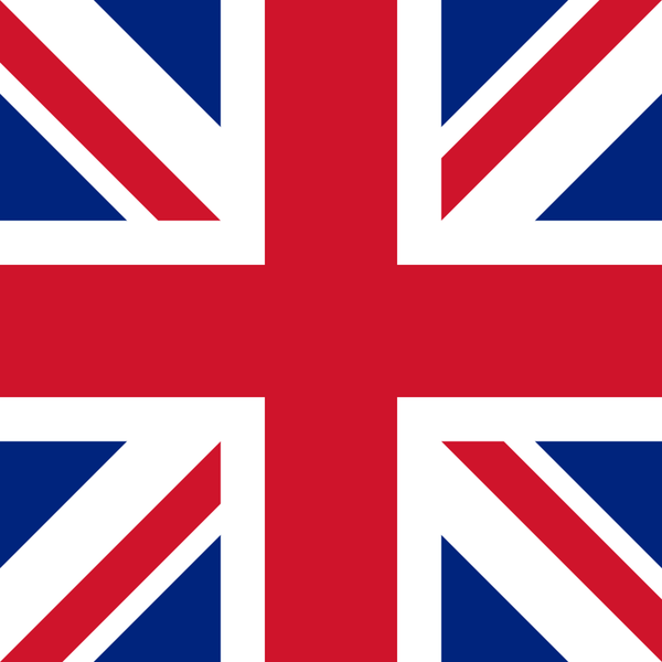
It looks a bit Brexity, but hopefully that’ll go away when they change the livery in a decade’s time or so
Removed by mod
Beautiful. You love to see it.
Any relation to the similarly named Bake Off?
“Great British” when it doesn’t cover Wales or Scotland. Hmm. Flag shagging has well and truly arrived.
A relatively small part of England around London is the only part of the UK that the ‘UK’ ever really cared about.
Or Liverpool funnily enough, they get to keep Merseyrail
Merseyrail isn’t part of the national network anyway, as a metro system.