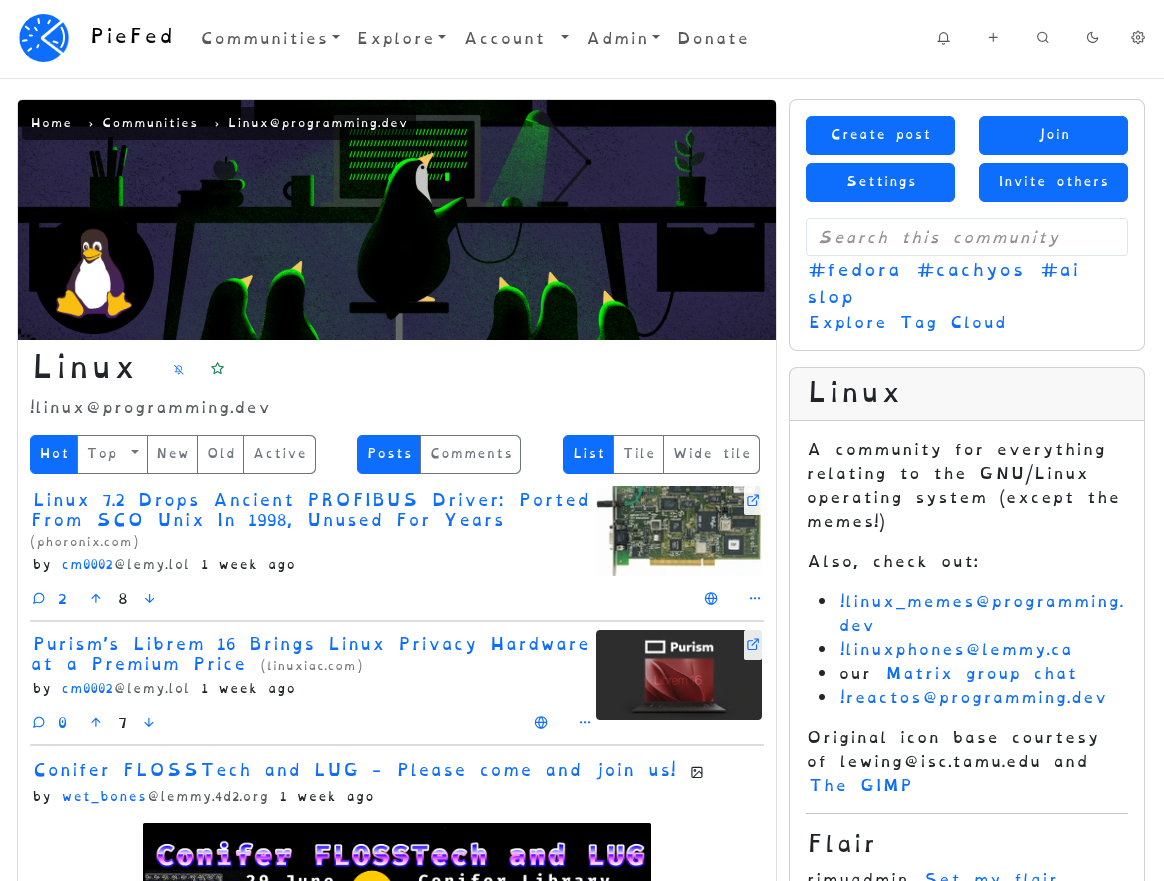

Go to https://piefed.social/user/settings and choose ‘OpenDyslexia’ in the Font setting, halfway down the form.
This font looks odd to me but I’m told that it really helps some people. If you’re one of those people, please let me know if you have any preferences around letter spacing or line height, etc.
Edit: PieFed also has Atkinson Hyperledgible
I am dyslexic, and I much prefer Atkinson Hyperlegible.
To be fait, dyslexia is quite variable, and mine is somewhat mild, but I like how readable yet elegant Atkinson is!
As a non dyslexic, Atkinson Hyperlegible is amazing. I love it. All their considerations are so thoughtful; it’s still aesthetic and functional.
I’m making it the default font everywhere I can.
I am dyslexic
Im not, but that font makes reading so much faster. It should be stock everywhere
PieFed has that font too :)
OMG! I was LITERALLY opening this post to comment “does anyone with dyslexia prefer Atkinson Hyperlegible?” I don’t have dyslexia, but it looks better, so I’m always curious if that trade-off has consequences. Based on what you said about it being mild, I guess the question is missing context. I wasn’t aware it had degrees.
I’m not an expert, but based on anecdotal evidence as well as what I was told by a specialist as a kid, Dyslexia technically is just the symptom of having difficulties with reading and/or writing. People will often have multiple “dys” conditions (not sure of the names in English, but difficulties speaking, with math/numbers, with orientation, with one’s understanding of their position in space, etc.).
I forget why, but we often bunch all that together and put it under the dyslexia for ease of use when it concerns language/learning. And it’s a clearly identified condition at that stage; that can be transmitted genetically (mostly by the father IIRC).
On one extreme, I’ve met people who could barely read at all, and were totally unable to write with a pen because of dyslexia; but I also know people who technically have common issues linked to it (slow reading, confusing similar letters, etc.) but would not qualify for a proper diagnosis because it is too mild to affect their life in an adverse way. So yeah, it’s one of these things that falls on a spectrum.
As for OpenDyslexic, I find it too “wonky” and lopsided. It almost feels like the letters aren’t sticking to their line. To be fair, that’s how I write, but it doesn’t mean I want to read wobbly text.
Atkinson Hyperlegible, on the other hand, helps a lot with things like l,p,q,i,j,I all having clear distinctions that help make words easier to understand.
This font is how I learned I’m just bad at reading and not dyslexic.
Its worth knowing that to my understanding, research doesnt actually support the idea that its easier to read these fonts with dyslexia, so it may not be the most useful diagnostic
Which shouldn’t preclude people from using it if they find it helpful, which is why I don’t generally bring that up, but if you wish to determine if you have dyslexia probably better to rely on any other evidence or experiences you have with respect to reading difficulties
You know, sometimes people say stuff just to be funny and lighten the mood.
yeah and sometimes people take it seriously and put effort into an informative response
Sorry, I missed that it was a joke 😅 reading tone over the internet is hard
Hope you have a lovely day ☺️
It’s because you didn’t have the font on 😂
You know, sometimes people take what people say at face value to just try and be a helpful and friendly person. It’s not something to be sarcastic about in response.
I dunno. I’m good at reading and my brain voice is doing the same confused staggered reading like When People Capitalise The First Letter Of Every Word For No Reason And The Subconsciousness Struggles To Read Fast Without Seeing Periods In There Or Discerning What’s A Title Or Propernoun Or Not.
I’m sorry, I missed that last bit. What’d you say again?
So this is a font designed to minimize the effect of dyslexia. I wonder what a font designed to maximize dyslexia would look like. 🤔
LMAO. I read the whole first few paragraphs thinking “this doesn’t feel different” only to realize it’s not in the font.
Neat demo, but:
if we can increase our understanding and give the correct help to these people just think how many more Richard Bransons, Elon Musks or Boyan Slats we can produce
No thanks
Yeah, I noticed that; the author should really have changed that by now. 😠
Still thanks for sharing as it’s cool visualisation, especially if you already have dyslexia: completely unreadable!
Hmm, clicking that link triggered my anti-virus software. Do you have any other source?
Just a guess, but if you’re using something like uBlock, you have something in place that blocks newer top level domains (
.infoin this case). That doesn’t mean the site is a problem, just that its TLD has a higher percentage of untrustworthy sites.Here’s the first article that popped up about the font: https://www.sciencealert.com/new-font-aims-to-help-people-understand-what-it-s-like-to-have-dyslexia
That
wasntbadatallThis may be stupid of me to ask but did you scroll down? I thought the same thing, at first, before realizing the initial text was not, in fact, the text that was supposed to be worse.
Haha, my god. No i did not
probably have 2 or more letters attached to each other?
Thanks!
I’m not dyslexic and I think this font is great. There is a unique readability to this font that I can’t quite put into words… and the reason I can’t quite put it into words is I am not as sensitive to the things that dyslexic people are with reading, or my brain can hide it from me easier… I don’t know but what I do know is that if it wasn’t for dyslexic people than this font would have never existed and I think it is a great example of how valuing accessibility for all has a cumulative benefit to everyone.