
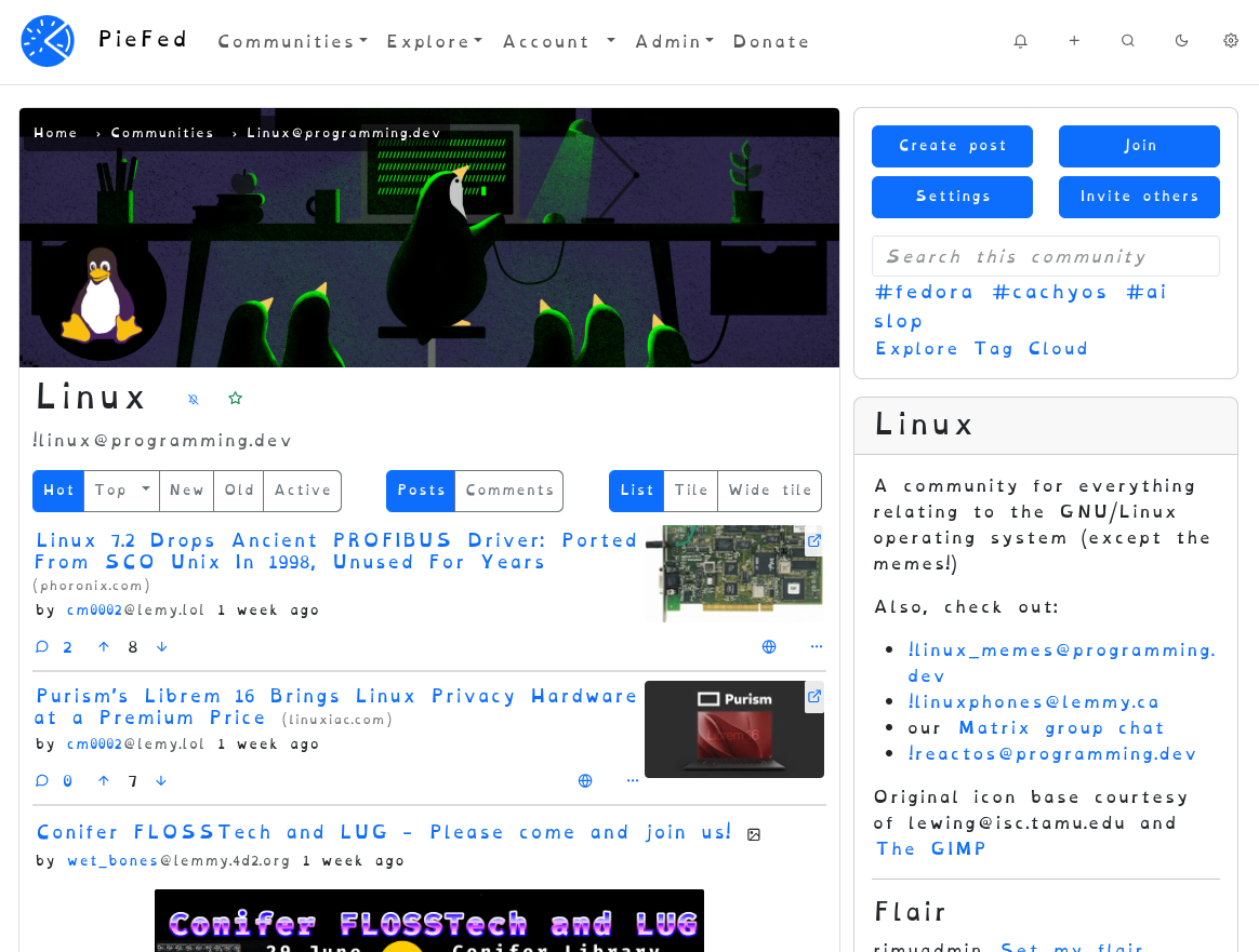
Go to https://piefed.social/user/settings and choose ‘OpenDyslexia’ in the Font setting, halfway down the form.
This font looks odd to me but I’m told that it really helps some people. If you’re one of those people, please let me know if you have any preferences around letter spacing or line height, etc.
Edit: PieFed also has Atkinson Hyperledgible
This font is how I learned I’m just bad at reading and not dyslexic.
Its worth knowing that to my understanding, research doesnt actually support the idea that its easier to read these fonts with dyslexia, so it may not be the most useful diagnostic
Which shouldn’t preclude people from using it if they find it helpful, which is why I don’t generally bring that up, but if you wish to determine if you have dyslexia probably better to rely on any other evidence or experiences you have with respect to reading difficulties
You know, sometimes people say stuff just to be funny and lighten the mood.
yeah and sometimes people take it seriously and put effort into an informative response
Sorry, I missed that it was a joke 😅 reading tone over the internet is hard
Hope you have a lovely day ☺️
It’s because you didn’t have the font on 😂
You know, sometimes people take what people say at face value to just try and be a helpful and friendly person. It’s not something to be sarcastic about in response.
I dunno. I’m good at reading and my brain voice is doing the same confused staggered reading like When People Capitalise The First Letter Of Every Word For No Reason And The Subconsciousness Struggles To Read Fast Without Seeing Periods In There Or Discerning What’s A Title Or Propernoun Or Not.
I’m sorry, I missed that last bit. What’d you say again?