I'm the developer of the Photon client. Try it out
Software Gore @lemmy.world You can disable the settings app from the settings app
LocalLLaMA @sh.itjust.works Qwen 3.5 is coming
Lemmy Shitpost @lemmy.world Add a post title
Just Post @lemmy.world Merry Christmas
Web Development @programming.dev Web Reading Mode: Determining the main page content
Linux Gaming @lemmy.world Is the steam client absolutely messed up for anyone else?
Lemmy Apps @lemmy.world What Lemmy/Piefed client(s) do you use?
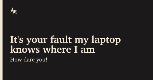
Technology @lemmy.world It's your fault my laptop knows where I am
Android @lemdro.id Google's sideloading restrictions are being eased up somewhat
LocalLLaMA @sh.itjust.works defend yourself against flock cameras with this simple trick
LocalLLaMA @sh.itjust.works Qwen3 VL support merged into llama.cpp
LocalLLaMA @sh.itjust.works My 8gb vram system as i try to load GLM-4.6-Q0.00001_XXXS.gguf:
Photon @lemdro.id UX suggestions?
LocalLLaMA @sh.itjust.works Light image editing models?
Selfhosted @lemmy.world Suggestions to have a home server VPN and and Mullvad at the same time?
LocalLLaMA @sh.itjust.works llama.cpp now has a Sveltekit based UI
Lemmy Shitpost @lemmy.world statistics show that a post is 67% funnier when you post it to a microblog first then screenshot it
Lemmy Shitpost @lemmy.world Mwa ha ha
Photon @lemdro.id Photon v2.0.2
Memes @sopuli.xyz winter fans


Ok