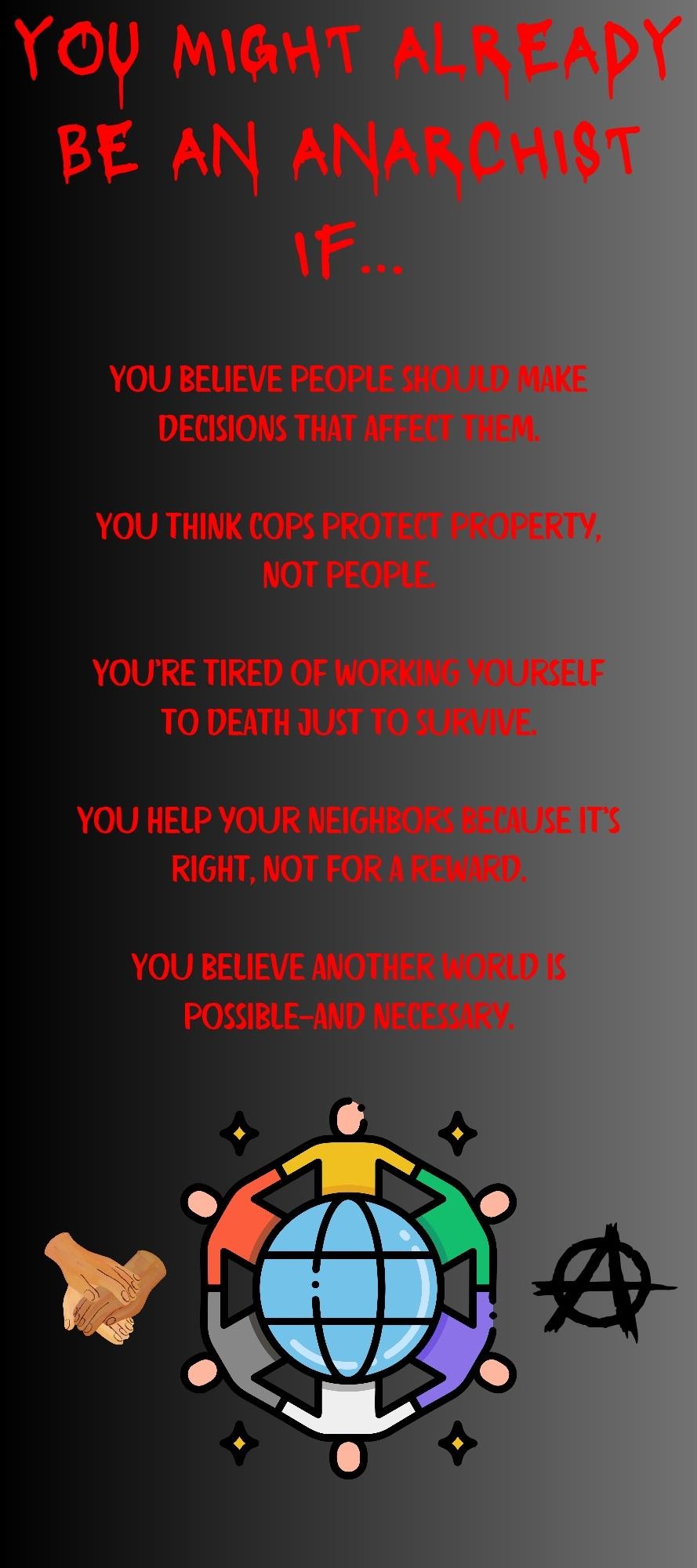
I was able to read it once zoomed in, but normal text size should have been more readable. The red is oversaturated & doesn’t contrast well against the grey gradient background. A darker red might’ve worked okay, although I’m not certain of that against the darker end of the gradient - the existing color choice certainly barely holds up against the lighter end, but there’s fortunately less text there.


I was able to read it once zoomed in, but normal text size should have been more readable. The red is oversaturated & doesn’t contrast well against the grey gradient background. A darker red might’ve worked okay, although I’m not certain of that against the darker end of the gradient - the existing color choice certainly barely holds up against the lighter end, but there’s fortunately less text there.
Looks like a lighter red version was uploaded and is way easier to read