
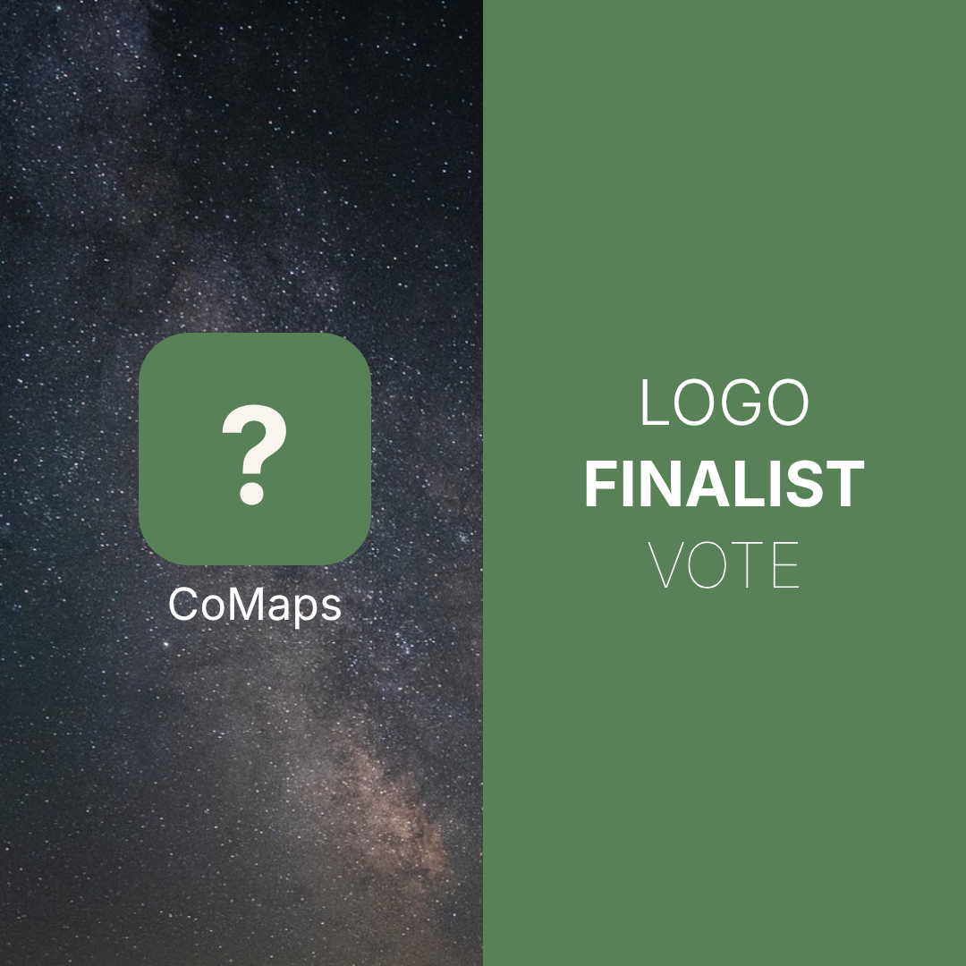
After dozens of ideas and tons of iteration in the community, we’re down to the final 6 logo designs — and your vote will help decide which one becomes the official face of CoMaps.
This isn’t just a design — it’s a symbol of open maps, privacy-respecting navigation, and a global community.
– Sign in to vote now, and be part of CoMaps history: https://codeberg.org/comaps/Governance/issues/102
– Voting closes: July 11
Let’s build this together!
You must log in or # to comment.
I really liked the continents and clouds logo in the previous voting issue. But, after the refinement, don’t like it as much.
Continents or Windy. The others are too boring and generic.
As long as it’s not windy I’m good
Pin, arrow, simple arrow. I’m not creating an account to vote. Why can’t they use a Mastodon poll?
Continents or Arrow for me.
I voted for Pin, Continents and Arrow. Seems like Arrow will win, though.
Needle for me. Makes it immediately obvious what it is

