
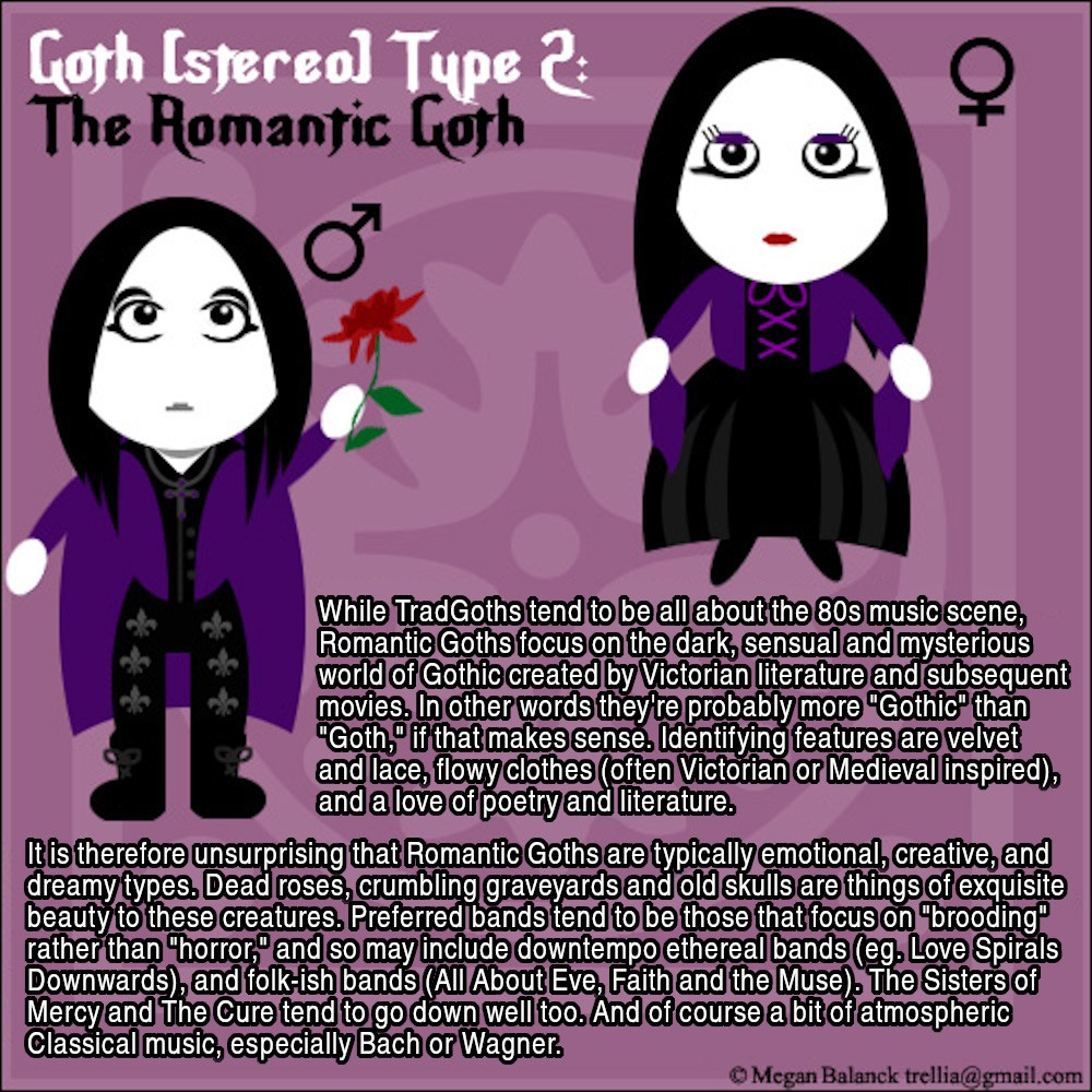
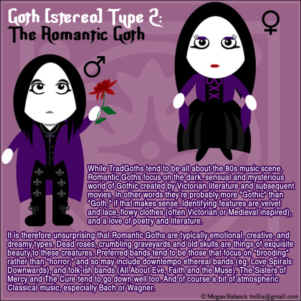
![Goth (stereo)Type 2: The Romantic Goth [comic / meme]](https://media.piefed.social/posts/gs/Xd/gsXd4SJGS2dpjQg.jpg)
Source / more: https://www.deviantart.com/trellia/gallery/25271332/goth-stereo-types Reposted with permission. I saw these elsewhere and emailed the artist/author who said it was OK to re-post them here. The oldest ones are from 2005, but there’s still a lot of truth in them!
Hey @hermit_lailoken@lemmy.world, here’s what I did about legibility. So first I tried making “higlighted” text, meme style i.e. with a sans-serif font in white outlined in black, like this:
With highlighted text:
but that looked a bit too “heavy”, like it distracted from the illustrations. So I tried it with a different color highlighting:
With different colored highlighting:
That actually looks nicer, tho still a little “heavy”. The thing is, to add that text, I gotta remove the original text by erasing it and re-creating the background pattern. In this case it was time-consuming but doable, BUT in some of the upcoming illustrations, there are some really intricate background patterns that it’d be tricky/impossible? to recreate. Really, the solution is to re-format the picture to be twice as tall, with much larger text and better contrasting backgrounds and one character in the top half and one in the bottom. But I didn’t feel right doing that many edits without the illustrator’s guidance, which is beyond the scope of these postings.
So here’s what I did to improve legibility:
- I scaled the pictures to be twice as large, i.e. 1000 by 1000 pixels rather than 500 by 500. Most browsers will scale this down for preview, but have some way of looking at the larger image and thus the larger text.
- I “sharpened” the text in the larger image, to make it more legible
- I added “Alt Text” of the image’s text in case it’s still not legible in the image.
I hope that makes the images legible, while still respecting the author’s original artwork.
Very cool collection